Thursday, 7 July 2011
Magazine Designs.
Above you can see all of my magazine front covers and spreads I created for my magazine project. I based my magazine on trainers and footwear.
Monday, 4 July 2011
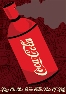
Final Poster Designs For Retro Project.
Above you can see both of my final poster designs for my retro project. To be honest I prefer the second design which I based in a silhouette style. The first design you can see I have made it look as if the coca cola can is a spray can spraying out the drink. I am very happy with both designs and feel they portray the product well.
Shepherd Fairey Style Poster.
Above you are able to see my poster in the style of Shepherd Faireys Obama 'Hope' design. As you can see I have also included the word 'Reem' at the bottom of my design. I really enjoyed creating this poster design and found it extremely interesting.
Brick Lane LDN
On Friday the 1st of July the class went to Brick Lane in London to visit the D&AD exhibition. The D&AD is described as the home of the talented and skilled, the imaginative and the curious, the restless and the bloody minded. The D&AD exhibition was a fairly big exhibition that was extremely interesting.
Another place where the class visited was the New Blood festival. The New Blood exhibition was a place where you gained the upper hand by building commercial awareness before entering the workforce. This is also where my fellow classmates took many of pictures.
Whilst walking around the streets of Brick lane etc, my fellow classmates took many pictures of the street art, which included graffiti, stencils, stickers and also artwork from space invader. I really like the street art in the pictures because it’s all very clever and you can tell that the artwork has been thought about.
The D&AD exhibition also included stalls from different universities, which included a lot of information about what their university offers; they also included a lot of information about their facilities etc.
Subscribe to:
Comments (Atom)


